I got this email from a good friend of mine and was very excited.
HIIIIII
right I have a very exciting thing to tell you...
I went on a shoot yesterday and there was this graphic designer there. He was a really nice guy, he works for himself and hes been doing it for 16 years and he is looking for another graphic designer to take on some of the work load. I said i knew you and he was like yeah yeah deffo give her my email and tell her to send me some pics of her work. He is really into like packaging and stuff so if you send him some of that kinda stuff he is well up to here from you :D
his email is :
simon@dearfloyd.com
his name is Simon Glenn. He is dead nice and he really wanted to talk to you :).
Let me know if you hear anything. Wooo
So i messaged the chappy with a link to my webstie and in waiting to hear back from him.
Tuesday, 31 May 2011
Contacting Barrie Tullett
I have recently contacted Barrie Tullett as he works at the Lincoln College of Art and Myself and a friend are planning on setting up a Pop Up shop in Lincoln and I wanted to see if he would be interested in getting involved or asking his students if they would be.
He got back to me and was very enthusiastic about the whole thing and asked to see a press release that he could populate around the College.
:D just have to finish Uni now and then can get planning it.
Thursday, 26 May 2011
Rob Ryan
I was so excited to find out that Rob Ryan was coming into give a talk, i only contacted him about 2 weeks ago and got a response saying he was to busy.
Hes just the most brilliant looking man, massive frizz hair, Adidas trainers, glasses and some coloured top and yet he produces these romantic and delicate imagery.
The talk was quite interesting finding out about him path to fame and how its not always been about his cut outs at all. He was a fine artist and he was very positive in talking about peoples careers and how you have to enjoy what you do. Also didn't realise that he didn't get paid for any of the John Lewis designs which seems absurd but its what has got him all this attention since and so it sort of seems worth it now.
I came away pretty positive about a career and really felt no pressure to get a job straight from Uni which is great but what stuck in my mind was Rob said that he loves what he does every day, all day every day. What a dream this must be. This is what i want.
Barrie Tullett
Barrie Tullett came and gave us a talk and a workshop today about his design career. He works at Lincoln Art College and is part of a design team called 'The Caseroom Press' where they use a lot of traditional printing methods such as letter press and wood block printing. His work has also been featured in publications such as Creative Review and EYE Magazine.
When Barry gave us a talk I was surprised about how negative he was being about himself and his work, only in a jockey way but most of the designers we talk to are very confident and believe solely in their work. But Barrie seemed very normal which was great when we were talking in the workshops.
He talked about what he does and where he works and those sorts of things but it wasn't until the workshop in the afternoon that we really started to see what he was talking about.
He showed us some examples of the work he and his team do and it was like nothing we have been shown my a professional designer before. I was really inspired to see a designer who was using these printing techniques and hand binding and self printed publications. Really showed me that actually a Graphic Designer doesn't have to spend hours preparing for print and leaves it at that but i could produce my own work fully and make a living out of it.
I needed this reassurance as I had stopped using these methods as i though i will never be able to use them in industry, and chances are i probably wont but its nice to know that its not all that graphic design is about.
Final Design Context Theme
It has been a long struggle to get a theme for my Design Context book, I really couldn't narrow it down at all. I know i wanted to do something that involved colour but that (obviously) was to wide so i had to think of a sub categorise for it.
I have finally chose to look at the Circus and how design as filtered through the circus style and into Graphic Design.
I realsie how much i love the circus, i have actually looked at loads of design that relates back to the circus style in one way or another. I really love the patterns that are associated with them and of course all those ornate typefaces. This is what i want to look at in my book, and colour feeds into that from all aspects.
Also most of the companies I have contacted have some work that i was inspired by that relates to the Circus. Mind Design, Project Seven, bwa design, all of these are some of my favourite companies.
New Blood
We had a briefing today that explained about New Blood and what we need to do if we want to go down. It sounds like a great opportunity but Fred mentioned that it is aimed at those people who want to work down in London and if you don't want to work down there then you need to think about why you are applying.
So I had a thought and I really don't want to work in London and there are many people in the class who do so I think it would be unfair for me to apply and get a space. Its not the last opportunity like this and I feel that I would only be applying for the sake of applying, therefore I have decided not to. Simple as that.
So I had a thought and I really don't want to work in London and there are many people in the class who do so I think it would be unfair for me to apply and get a space. Its not the last opportunity like this and I feel that I would only be applying for the sake of applying, therefore I have decided not to. Simple as that.
No Pitch - Little Summer House
Didn't end up getting the little summer house pitch as Chloe got it, she did some great work on it and really showed the potential in it so Well Done Chloe!
This has made me realise how important it is when pitching an idea to a client, showing them what the identity could be and just doing that bit extra for the brief makes the difference in being successful within the pitch.
This has made me realise how important it is when pitching an idea to a client, showing them what the identity could be and just doing that bit extra for the brief makes the difference in being successful within the pitch.
The Little Summerhouse Briefing
Really excited about the Little Summer House brief, there was only 3 of us pitching for it and we are all really different in our approaches and styles so i think we are going to come out with some interesting outcomes.
I want to tackle this is a typographic way using colour and layout to create an organic childminding identity. We only have to produce the stationary but i thin i will try and show a website as well as he mentioned that he potentially would want one designing.
I want to tackle this is a typographic way using colour and layout to create an organic childminding identity. We only have to produce the stationary but i thin i will try and show a website as well as he mentioned that he potentially would want one designing.
Working with a cleint - first Tuesday
The first Tuesday brief has been a real eye opener for me, its the first project that i have worked on that has been with a client who's not a friend or family. Its also the first time that i have project managed a project and been responsible for all the deadlines being met and all contact with the client. It got me to be much more organised with files and my time as the client was demanding things on a quick turn around that had to be done.
However unfortunately we had a lot more work that first proposed as the dates kept moving and this meant that the material had to be constantly updated and re-printed for the client meaning we had to drop whatever we were doing to accommodate for the client.
However unfortunately we had a lot more work that first proposed as the dates kept moving and this meant that the material had to be constantly updated and re-printed for the client meaning we had to drop whatever we were doing to accommodate for the client.
First Tuesday Concept briefing
We had a brilliant meeting with Bridget today about the first tuesday project. She really likes out idea and concepts and has given us full creative control over the designs. Me and Hannah are pretty chuffed about this as awe expected to have to change things to fit in with what she wanted. We had designed the identity through a lot of research about the audience and the approach going for and so to have Bridget realise that it works is a great thing from a client.
First Tuesday Briefing with Bridget
Had out briefing with Bridget today about the First Tuesday project and what she is looking to get out of it.
She has left it quite open to use in terms of design direction and has only stated the deliverables that need to be produced.
She has left it quite open to use in terms of design direction and has only stated the deliverables that need to be produced.
Cargo Collective Image Size
Well my cargo collective page has fun out of space!
I really need to start getting into the routine of saving all my images for web and making them the right size for the site.
So my images all going to be save at 72dpi which i should have been doing anyway but i'm going to resize them all to 600px wide so they will all be standardised and i can get more on there.
Cargo Collective Website
I have just set up my website using cargo collective and i am really happy with it. I have gone for a really simple layout that shows all my projects when you first head to the page as im not a fan of these blank pages with a tiny navigation bar at the side. My work is visual and i want people to see it instantly and be excited by what they see.

Leeds Loves Creativity Resolution
Final resolved products for the leeds loves creativity brief. This brief was really only meant to be a short 1 day identity brief but found that it has been easy to apply it to a range of products to simply show how the identity works.

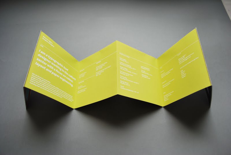
Creative Resumes
Produced my creative CV and mini portfolio in a day and really happy with it. I saw the idea of a concertina fold for a leaflet and decided this would work perfect for my own practice. It holds all the elements that my wok is abut, colour, paper fold, stock, typography and layout.
The idea is that when i visit professionals then i can leave this behind and it something that reminds them of who i am and what work i did as well as showing a bit more personality within my CV


Subscribe to:
Comments (Atom)